Insights
Insights help you better understand and analyze relationships in your IT and process landscape. They help you, for example, with questions about the application landscape, costs, or dependencies between objects.
Most Insights are displayed as a matrix. In this view, different objects are related to each other and highlighted with colors based on key figures. This helps you recognize patterns, relationships, and possible need for action at a glance.
Additional display formats are also available:
In the Roadmap section, you can see the temporal development and lifecycle of objects.
In the Hierarchy section, you can see a visual representation of your processes and their structure.
For full access to all Insights, the module Enterprise Architecture Management (EAM) must be purchased and activated for you. BIC EAM is a separate license and extends the analysis functions in BIC.
Note
The Process hierarchy Insight is also available by default without BIC EAM.
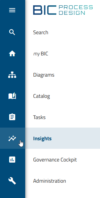
Where can I find the Insights?
If BIC EAM has been purchased and activated for you, all users can open the Insights via the Insights menu item in the left menu bar. If BIC EAM has not been purchased or is not activated, only users with the Administrator, Editor, or Author user role can open the Insights. In this case, only the Process hierarchy Insight is available.
After opening, you will see an overview with different tiles. Each tile stands for an Insight. The Insights are divided into four sections:
Matrix
Map
Roadmap
Hierarchy
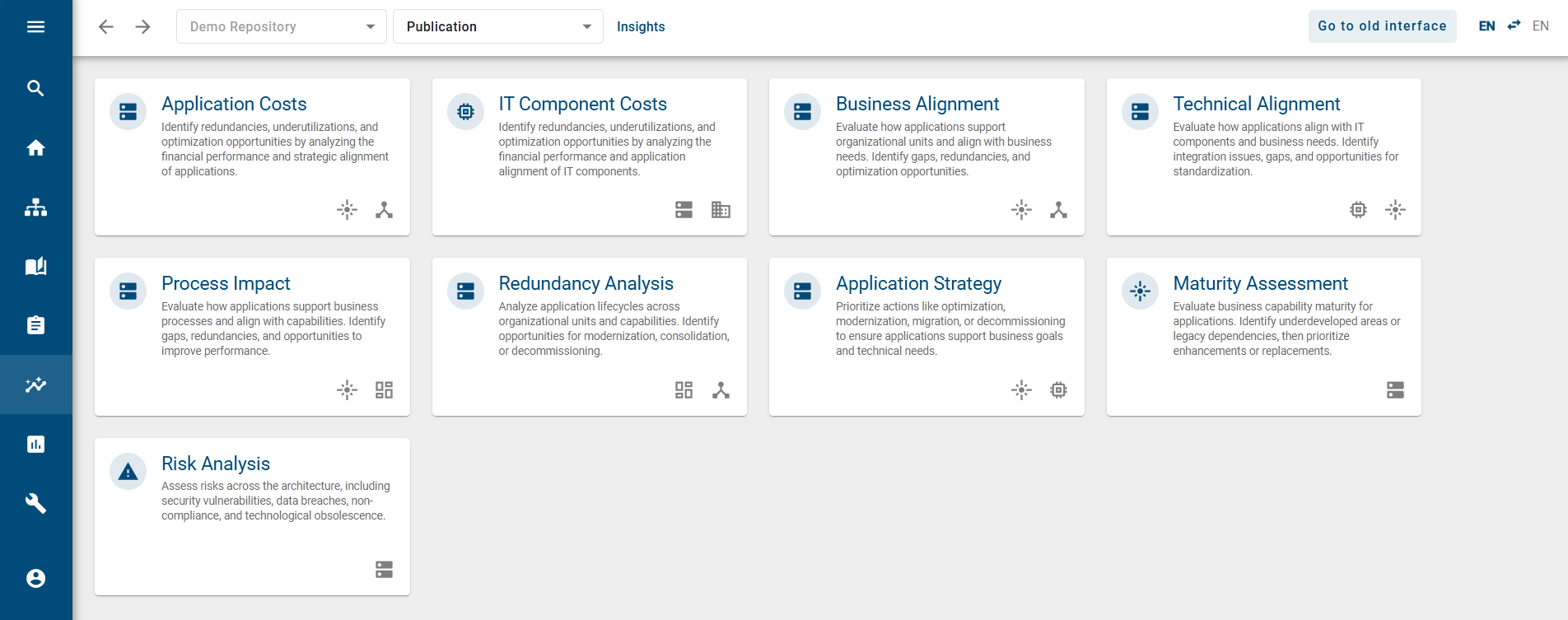
Each section contains several tiles with different evaluations and questions.
The Matrix and Map sections contain Insights that are displayed as a matrix. The Insights contain technical notes on typical EAM-related questions.
The Roadmap section contains Insights on the temporal development of objects.
The Hierarchy section contains a visual representation of processes.
If you select a tile, the corresponding Insight opens. You can find more information about the individual Insights here.
Which Insights are available and what are their functions?
If BIC EAM has been purchased and activated for you, all users can open the Insights via the Insights menu item in the left menu bar. If BIC EAM has not been purchased or is not activated, only users with the Administrator, Editor, or Author user role can open the Insights. In this case, only the Process hierarchy Insight is available.
There you will see an overview with predefined tiles. These are divided into the sections Matrix, Map, Roadmap, and Hierarchy. The individual sections mainly differ in their display:
The Matrix and Map sections are displayed as a matrix
The Roadmap section shows objects along a timeline as bars with their lifecycle phases
The Hierarchy section is displayed as a process structure
Each section contains Insights with a clear functional question.
Matrix
In the Matrix section, you see Insights that compare different objects with each other. Relationships between several object types are displayed and evaluated, for example between applications, business capabilities, or organizational units. The results are shown in a matrix and highlighted with colors based on key figures. This helps you recognize patterns and make informed decisions.
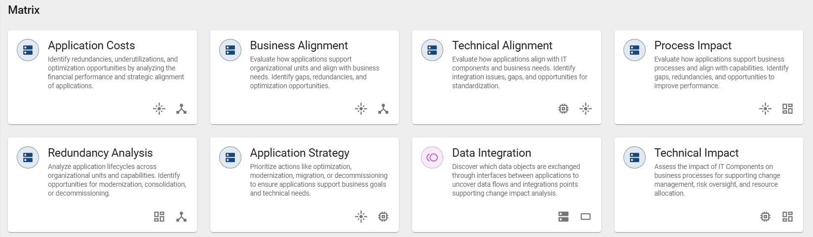
Application Costs:
The “Application Costs” Insight shows the costs of applications and their strategic alignment. It displays the relationships between applications, business capabilities, and organizational units. This helps you identify redundancies, underutilization, and optimization opportunities. By default, the coloring is based on total annual costs.
Business Alignment:
The “Business Alignment” Insight shows how well applications support business requirements. It displays the relationships between applications, business capabilities, and organizational units. This helps you identify gaps, redundancies, and optimization potential. By default, the coloring is based on functional suitability.
Technical Alignment:
The “Technical Alignment” Insight shows how well applications are technically aligned. It displays the relationships between applications, business capabilities, and IT components. This helps you identify integration problems, gaps, and standardization potential. By default, the coloring is based on technical suitability.
Process Impact:
The “Process Impact” Insight shows how applications support business processes. It displays the relationships between applications, business capabilities, and business contexts. This helps you identify gaps, redundancies, and opportunities for improvement. By default, the coloring is based on functional suitability.
Redundancy Analysis:
The “Redundancy Analysis” Insight shows the lifecycle of applications across organizational units and business capabilities. It displays the relationships between applications, business contexts, and organizational units. This helps you identify potential for modernization, consolidation, and decommissioning. By default, the coloring is based on lifecycle status.
Application Strategy:
The “Application Strategy” Insight supports strategic decisions about applications, for example optimization, migration, or decommissioning. It displays the relationships between applications, business capabilities, and IT components. This helps you identify the need for action. By default, the coloring is based on the TIME classification.
Data Integration:
The “Data Integration” Insight shows how applications are connected to each other and exchange data. It displays the relationships between applications, interfaces, and data objects. This helps you better understand the impact of changes. By default, the coloring is based on frequency.
Technical Impact:
The “Technical Impact” Insight shows how IT components influence business processes. It displays the relationships between applications, IT components, and business contexts. This supports change management and risk monitoring. By default, the coloring is based on technical suitability.
Org Application Coverage:
The “Org Application Coverage” Insight shows which applications are used by organizational units to support business capabilities. It displays the relationships between business capabilities, applications, and organizational units.
Org Capability Enablement:
The “Org Capability Enablement” Insight shows how business capabilities are implemented in different organizational units. It displays the relationships between business capabilities, business contexts, and organizational units. This helps you identify gaps and overlaps.
Business Capability Coverage:
The “Business Capability Coverage” Insight shows how applications and business contexts support business capabilities. It displays the relationships between business capabilities, applications, and business contexts. This helps you identify gaps, redundancies, and opportunities for improvement.
Map
In the Map section, you see Insights that display direct relationships between two object types. These Insights help you quickly identify relationships and dependencies.
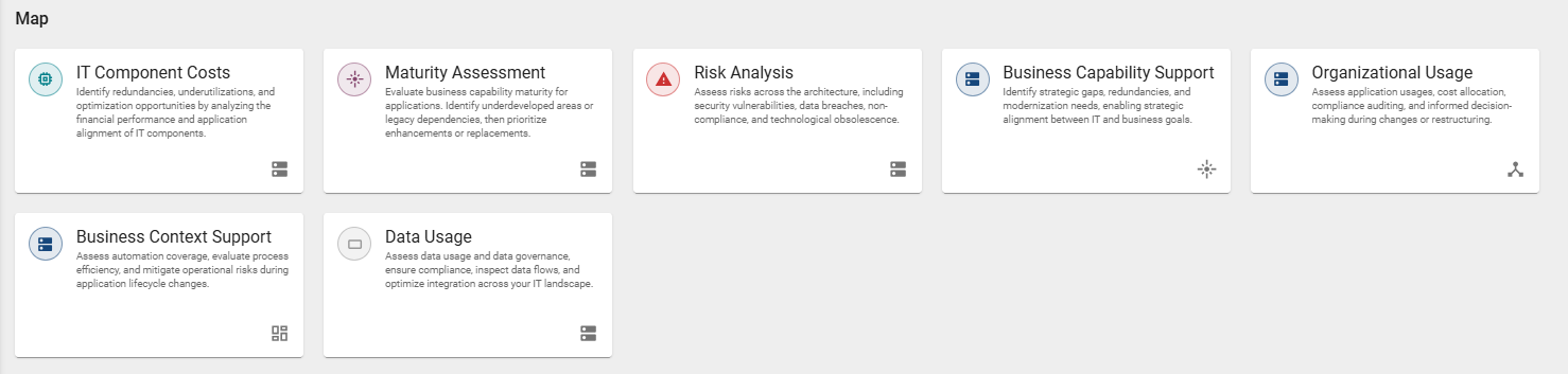
IT Component Costs:
The “IT Component Costs” Insight shows the costs of IT components. It displays the relationships between applications and IT components. This helps you identify redundancies and optimization potential. By default, the coloring is based on total annual costs.
Maturity Assessment:
The “Maturity Assessment” Insight shows the maturity level of business capabilities. It displays the relationships between applications and business capabilities. This helps you identify underdeveloped areas and dependencies. By default, the coloring is based on the maturity level.
Risk Analysis:
The “Risk Analysis” Insight shows risks in the architecture, for example security or compliance risks. It displays the relationships between applications and risks. This helps you identify weaknesses. By default, the coloring is based on the level of damage.
Business Capability Support:
The “Business Capability Support” Insight shows how well applications support business capabilities. It displays the relationships between applications and business capabilities. This helps you identify gaps and modernization needs. By default, the coloring is based on functional suitability.
Organizational Usage:
The “Organizational Usage” Insight shows how applications are used in an organizational context. It displays the relationships between applications and business contexts. This supports decisions during changes. By default, the coloring is based on functional suitability.
Business Context Support:
The “Business Context Support” Insight shows how applications support organizational processes. It displays the relationships between applications and organizational units. This helps you assess automation and risks. By default, the coloring is based on functional suitability.
Data Usage:
The “Data Usage” Insight shows how data is used in the IT landscape. It displays the relationships between applications and data objects. This helps you review and optimize data flows. By default, the coloring is based on personal data.
Org Capabilities Allocation:
The “Org Capabilities Allocation” Insight shows where business capabilities are anchored in the organization. It displays the relationships between business capabilities and organizational units.
Capability Context:
The “Capability Context” Insight shows how business contexts contribute to the implementation of capabilities. It displays the relationships between business capabilities and business contexts.
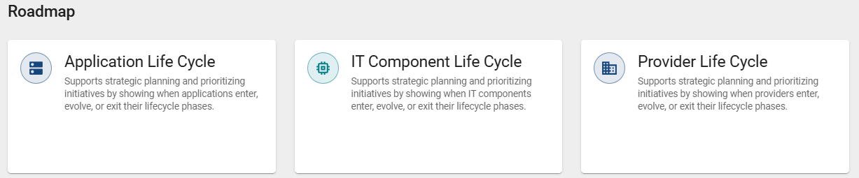
Roadmap
In the Roadmap section, you see Insights on the temporal development of catalog objects. These Insights show when objects enter certain lifecycle phases, change, or expire. This supports you in planning and prioritization.
The following roadmaps are available:
Application Life Cycle
IT Component Life Cycle
Provider Life Cycle
Initiative Life Cycle
In addition, the Governance roadmap is available for users with the Administrator or Editor user role. This takes you to the Governance Cockpit menu item. There, you can analyze validity periods and react early to changes. You can find more information about this here.
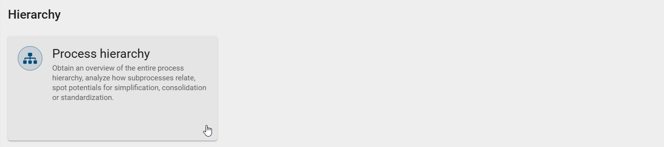
Hierarchy
In the Hierarchy section, the Process hierarchy Insight is available. This Insight is only available to users with the Administrator, Editor, or Author user role. This Insight shows a visual representation of your processes and their structure. You can see how main processes are connected to their subprocesses. This gives you an overview of your process landscape and helps you better understand relationships. It also helps you identify potential for simplification, consolidation, or standardization.
Note
The Process hierarchy Insight is also available by default without purchasing BIC EAM.
Matrix and Map
How are the Insights in the Matrix and Map sections displayed?
If BIC EAM has been purchased and activated for you, all users can open the Insights via the Insights menu item in the left menu bar. If BIC EAM has not been purchased or is not activated, only users with the Administrator, Editor, or Author user role can open the Insights. In this case, only the Process hierarchy Insight is available.
Open the Insights menu item in the left menu bar and select a tile from the Matrix or Map section. After opening, the Insight is displayed in a matrix.
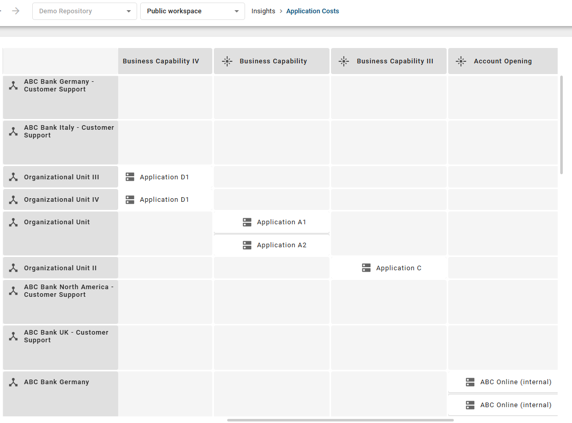
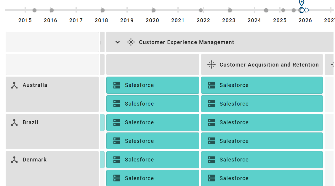
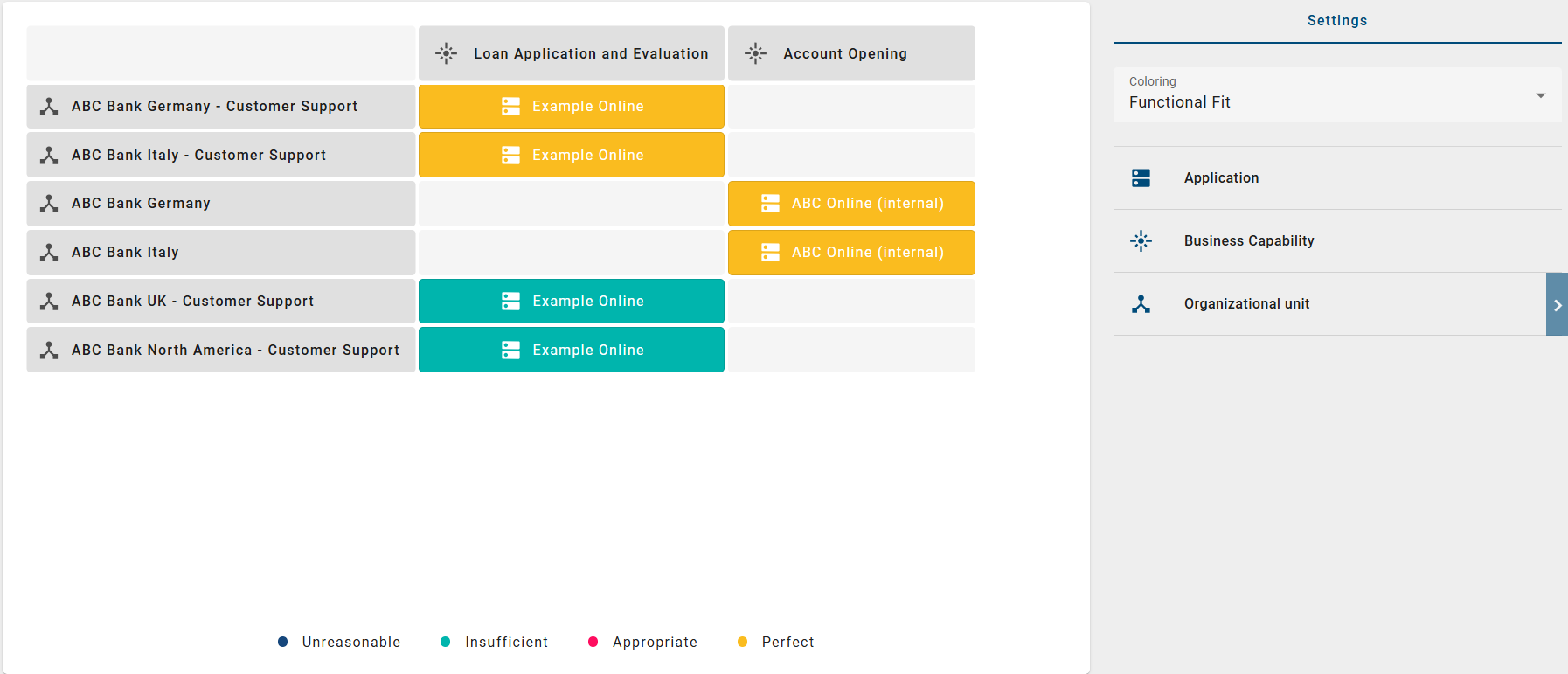
This matrix shows relationships between objects. The objects are shown as rows and columns. In the cells, you can see which objects are connected to each other. The data comes from all diagrams in the selected repository and stage. By default, the data refers to the current day. If diagram access restrictions apply to you, this content is not displayed.
Objects are shown in the cells that are linked to the corresponding row and column objects. These links form the basis of the matrix. In the right sidebar, in the Options panel, you can filter the displayed main and axis objects. In addition, the main objects can be highlighted with colors based on an attribute.
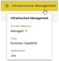
When you move the mouse over an object, additional information is displayed. This also includes the related row and column objects.
If the matrix is larger than the visible area, you can move within it. Hold down the left mouse button and drag the view in the desired direction. The view remains at the selected position.
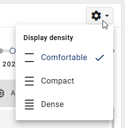
How can I change the display density of an Insight?
If BIC EAM has been purchased and activated for you, all users can open the Insights via the Insights menu item in the left menu bar. If BIC EAM has not been purchased or is not activated, only users with the Administrator, Editor, or Author user role can open the Insights. In this case, only the Process hierarchy Insight is available.
Open the Insights menu item in the left menu bar and select a tile from the Matrix or Map section. After opening, the Insight is displayed in a matrix.
You can set how dense the matrix is displayed. In the Comfortable setting, the spacing is larger. This makes the display clear, but it requires more space. In the Compact and Dense settings, the spacing is smaller. This lets you see more information at the same time.
Click the gear icon in the top right of the matrix. Select the desired setting.
Note
The setting is not saved. If you open another Insight, you must set the display density again.
How can I display the details of an object in an Insight?
If BIC EAM has been purchased and activated for you, all users can open the Insights via the Insights menu item in the left menu bar. If BIC EAM has not been purchased or is not activated, only users with the Administrator, Editor, or Author user role can open the Insights. In this case, only the Process hierarchy Insight is available.
Open the Insights menu item in the left menu bar and select a tile from the Matrix or Map section. After opening, the Insight is displayed in a matrix.
Click an object in the matrix. The object is highlighted. In the right sidebar, in the Details panel, you will see all available information about this object.
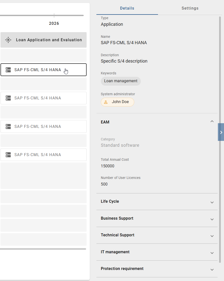
Alternatively, you can right-click an object and select the Show attributes option.
How can I switch between the profile view and the attribute view?
If BIC EAM has been purchased and activated for you, all users can open the Insights via the Insights menu item in the left menu bar. If BIC EAM has not been purchased or is not activated, only users with the Administrator, Editor, or Author user role can open the Insights. In this case, only the Process hierarchy Insight is available.
Open the Insights menu item in the left menu bar and select a tile from the Matrix or Map section. After opening, the Insight is displayed in a matrix.
Click an object in the matrix. The object is highlighted. In the right sidebar, in the Details panel, you will see all available information about this object. You can switch between the profile view and the attribute view using a toggle.
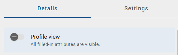
In the profile view, you see a compact overview of the object. This view only shows the most important information and corresponds to the view that users with the Reader user role have.
In the attribute view, you see all filled attributes of the object. This view is more detailed and is suitable when you need complete information.
Note
This function is only available if the profile has been activated in Administration. Otherwise, you will only see the attribute view.
How can I display the content of an Insight by hierarchy levels?
If BIC EAM has been purchased and activated for you, all users can open the Insights via the Insights menu item in the left menu bar. If BIC EAM has not been purchased or is not activated, only users with the Administrator, Editor, or Author user role can open the Insights. In this case, only the Process hierarchy Insight is available.
Open the Insights menu item in the left menu bar and select a tile from the Matrix or Map section. After opening, the Insight is displayed in a matrix.
If the displayed row or column objects are based on hierarchies, only the top hierarchy level is shown at first. In the cells, you will see all objects that are linked to these elements or to elements below them.
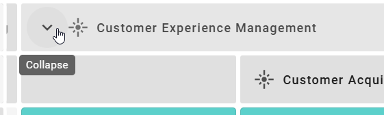
If an object contains additional hierarchy levels, you can expand them. To do this, click the Expand button next to the corresponding row or column header.
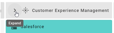
The matrix is then adjusted. New rows or columns are added and the content is redistributed accordingly. If you want to reduce the view again, click the Collapse button. The additional hierarchy levels are then hidden again.
Hint
If you apply filters to column or row objects, these are automatically transferred to all hierarchy levels.
How can I filter objects and attributes in an Insight?
If BIC EAM has been purchased and activated for you, all users can open the Insights via the Insights menu item in the left menu bar. If BIC EAM has not been purchased or is not activated, only users with the Administrator, Editor, or Author user role can open the Insights. In this case, only the Process hierarchy Insight is available.
Open the Insights menu item in the left menu bar and select a tile from the Matrix or Map section. After opening, the Insight is displayed in a matrix.
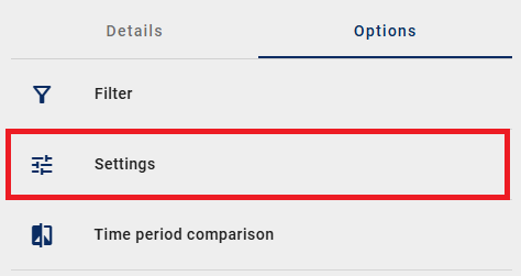
In the right sidebar, you will find the Options panel. Click the Filter option there.
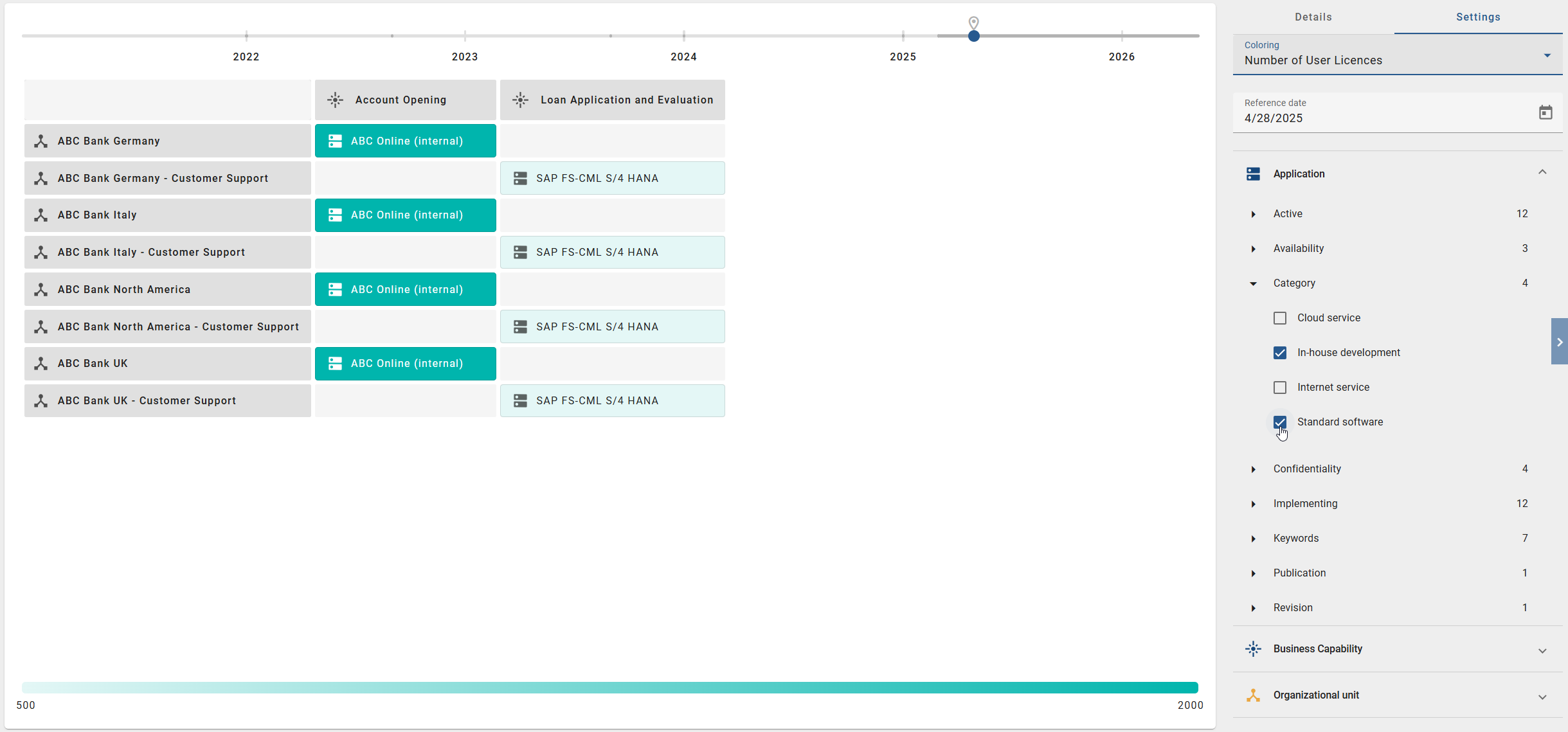
After opening it, all objects that are used in the current Insight are displayed. These objects are shown as filter facets. If you select a filter facet, it expands. You then see the available values or properties for this object type.
Select the desired values by activating the checkboxes. The matrix is then updated automatically and shows only the matching objects.
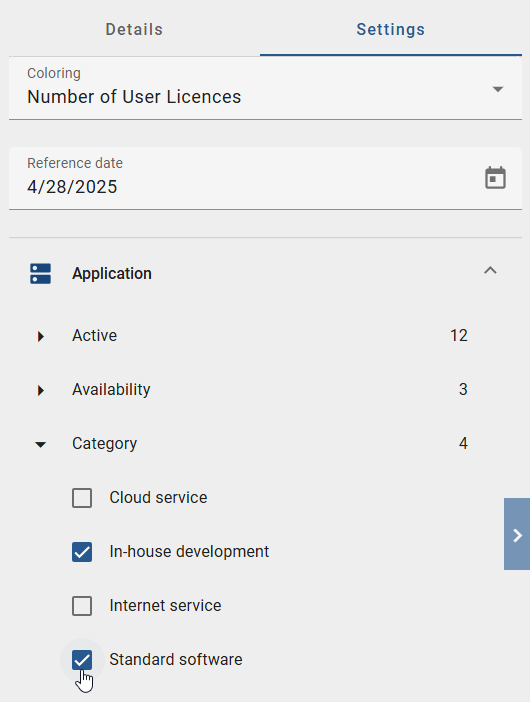
You can also filter by node attributes. In the filter facets, you will see the available attributes and their values. This allows you to narrow down the displayed cell objects in a targeted way.
How can I change the coloring in an Insight?
If BIC EAM has been purchased and activated for you, all users can open the Insights via the Insights menu item in the left menu bar. If BIC EAM has not been purchased or is not activated, only users with the Administrator, Editor, or Author user role can open the Insights. In this case, only the Process hierarchy Insight is available.
Open the Insights menu item in the left menu bar and select a tile from the Matrix or Map section. After opening, the Insight is displayed in a matrix.
In the matrix, the main objects are highlighted with colors by default based on an attribute. The current coloring is explained in a legend at the bottom of the view. To change the coloring, open the Options panel in the right sidebar. Click the Settings option there.
In this option, you will find the Coloring drop-down field. Select another attribute there.
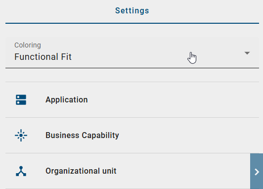
As soon as you select an attribute, the coloring in the matrix is adjusted immediately. The legend is updated automatically and shows the new color assignment.
How can I change the reference date in an Insight?
If BIC EAM has been purchased and activated for you, all users can open the Insights via the Insights menu item in the left menu bar. If BIC EAM has not been purchased or is not activated, only users with the Administrator, Editor, or Author user role can open the Insights. In this case, only the Process hierarchy Insight is available.
Open the Insights menu item in the left menu bar and select a tile from the Matrix or Map section. After opening, the Insight is displayed in a matrix.
The displayed data refers to the current day by default. To change the reference date, open the Options panel in the right sidebar and click the Settings option.
In this option, you will find the Reference date field. There, you can either enter a date directly or select it using the calendar.
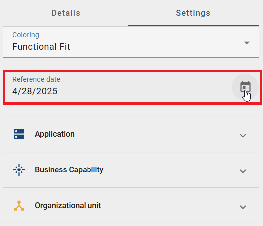
Alternatively, you can change the reference date using the timeline at the top of the view. Move the slider or click a point in time on the timeline.

As soon as you change the reference date, the data in the matrix is updated automatically. If you previously set a coloring, it remains unchanged.
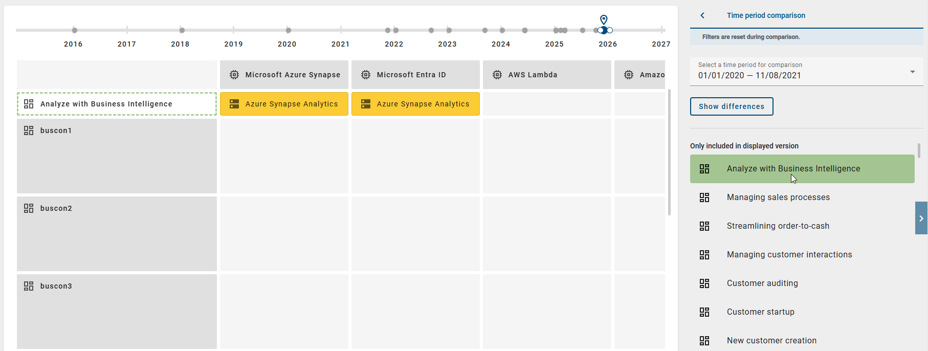
How can I compare changes in an Insight between two time periods?
If BIC EAM has been purchased and activated for you, all users can open the Insights via the Insights menu item in the left menu bar. If BIC EAM has not been purchased or is not activated, only users with the Administrator, Editor, or Author user role can open the Insights. In this case, only the Process hierarchy Insight is available.
Open the Insights menu item in the left menu bar and select a tile from the Matrix or Map section. After opening, the Insight is displayed in a matrix.
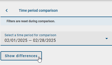
In the right sidebar, in the Options panel, you can select the Time period comparison option.
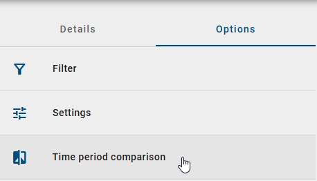
Then select a time period from the drop-down menu and click the Show differences button.
An overview is displayed below the selection. There, you can see the differences between the selected period and the current view.
The changes are divided into two sections:
Not included in displayed version: Objects that existed before but are now missing
Only included in displayed version: Objects that have been added
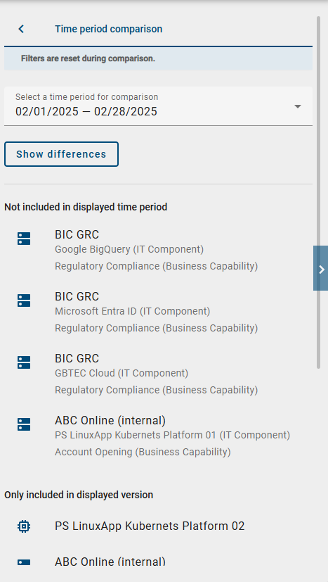
For cell objects, the related row and column objects are also shown. This helps you better understand the position in the matrix.
Hint
Active filters are not taken into account during the time period comparison and are automatically deactivated.
How can I highlight an object in the time period comparison of an Insight?
If BIC EAM has been purchased and activated for you, all users can open the Insights via the Insights menu item in the left menu bar. If BIC EAM has not been purchased or is not activated, only users with the Administrator, Editor, or Author user role can open the Insights. In this case, only the Process hierarchy Insight is available.
Open the Insights menu item in the left menu bar and select a tile from the Matrix or Map section. After opening, the Insight is displayed in a matrix.
In the right sidebar, in the Options panel, you can select the Time period comparison option.
If you selected a time period and compare it with the selected Insight, the differences are shown in an overview. If you select a cell object in the Only included in displayed version section, it is highlighted in the matrix and in the overview. If the object is currently not visible, the view is moved automatically.
If the object is located in a collapsed hierarchy level, that level is expanded automatically. The highlight is removed when you select another object or click the same object again. As soon as you leave the time period comparison, all highlights are reset.
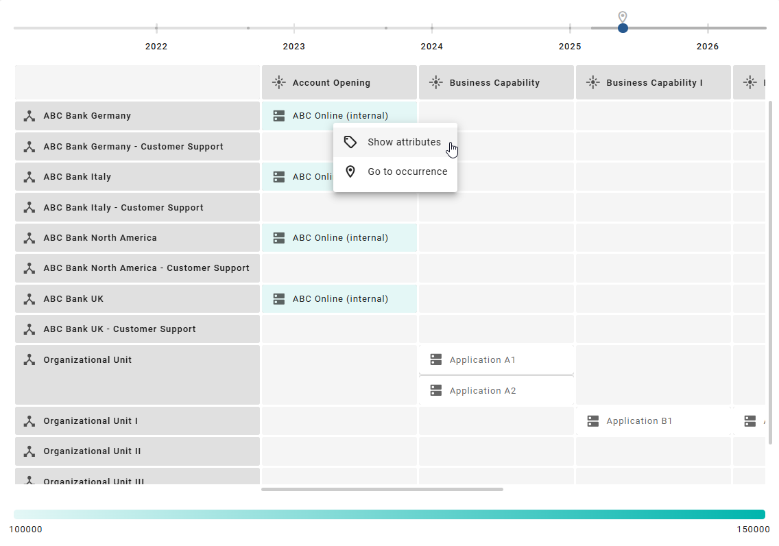
How can I navigate to the related diagram of an object in the Matrix and Map sections?
If BIC EAM has been purchased and activated for you, all users can open the Insights via the Insights menu item in the left menu bar. If BIC EAM has not been purchased or is not activated, only users with the Administrator, Editor, or Author user role can open the Insights. In this case, only the Process hierarchy Insight is available.
Open the Insights menu item in the left menu bar and select a tile from the Matrix or Map section. After opening, the Insight is displayed in a matrix.
Right-click an object in the matrix. Then select the Go to occurrence option.
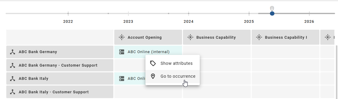
You will be taken directly to the diagram in which the object is used. The object is highlighted there and the details are shown in the right sidebar.
Roadmap
How are the Insights in the Roadmap section displayed?
If BIC EAM has been purchased and activated for you, all users can open the Insights via the Insights menu item in the left menu bar. If BIC EAM has not been purchased or is not activated, only users with the Administrator, Editor, or Author user role can open the Insights. In this case, only the Process hierarchy Insight is available.
Open the Insights menu item in the left menu bar and select a tile from the Roadmap section.
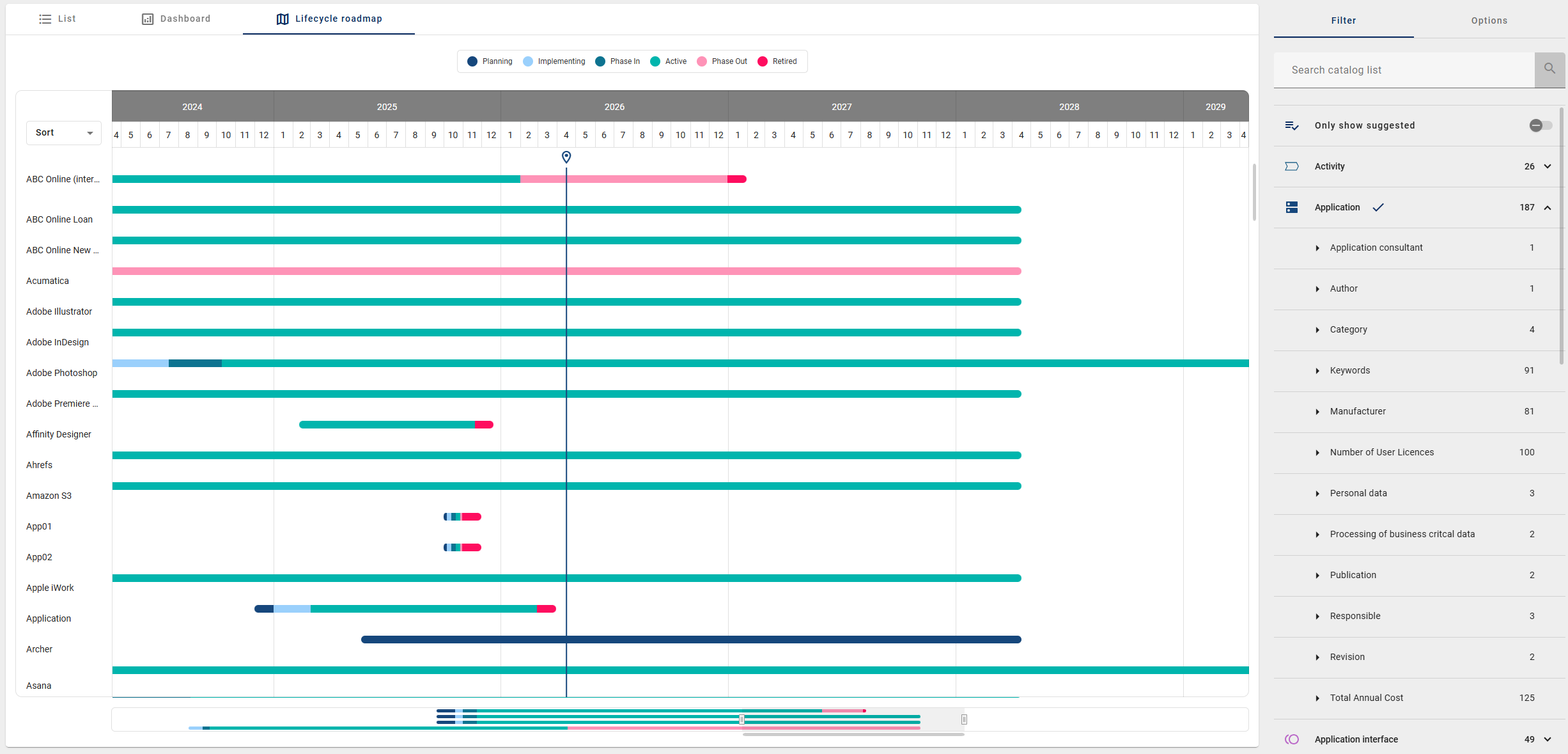
After opening, you are taken directly to the corresponding lifecycle roadmap. It is displayed in the catalog.
The roadmaps show the temporal development and lifecycle status of catalog objects. A separate roadmap is available for each catalog object type:
Applications
IT components
Providers
Initiative
The roadmap is shown as a timeline. On this timeline, you can see the lifecycle of the individual objects. The colors show the different lifecycle phases. This helps you quickly recognize which phase an object is in. The current day is marked separately. This marking helps you orient yourself in time. It can be before, within, or after the displayed period.
In the right sidebar, in the Filter panel, filtering is applied automatically for the selected catalog object type.
Note
The roadmap is based on the maintained lifecycle data of the catalog objects. If this data is missing, the roadmap cannot be displayed or can only be displayed to a limited extent.
Note
Previously, the lifecycle roadmaps could only be accessed through the Catalog and were only visible if the corresponding “Lifecycle” attribute group had been maintained for a filtered catalog object. Since this display form is not always easy to find, the roadmaps are now also available in the Insights menu item.
Hierarchy
How is the process hierarchy displayed?
If BIC EAM has been purchased and activated for you, all users can open the Insights via the Insights menu item in the left menu bar. If BIC EAM has not been purchased or is not activated, only users with the Administrator, Editor, or Author user role can open the Insights. In this case, only the Process hierarchy Insight is available.
Open the Insights menu item in the left menu bar and select the Process hierarchy tile in the Hierarchy section. The process hierarchy is only available to users with the Administrator, Editor, or Author user role.
After opening it, a note is displayed first. There, you are asked to select a start process. In the right sidebar, in the Settings panel, you can select a start diagram. This diagram forms the starting point of the display. All diagrams for which no access restrictions apply are available.
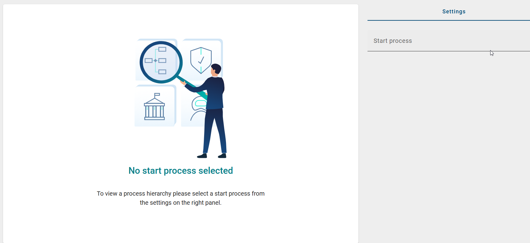
The selected start diagram must contain at least one subprocess (VCD, BPMN, or EPC). It is shown in the center of the display. All related subprocesses are loaded automatically. They are shown in several levels.
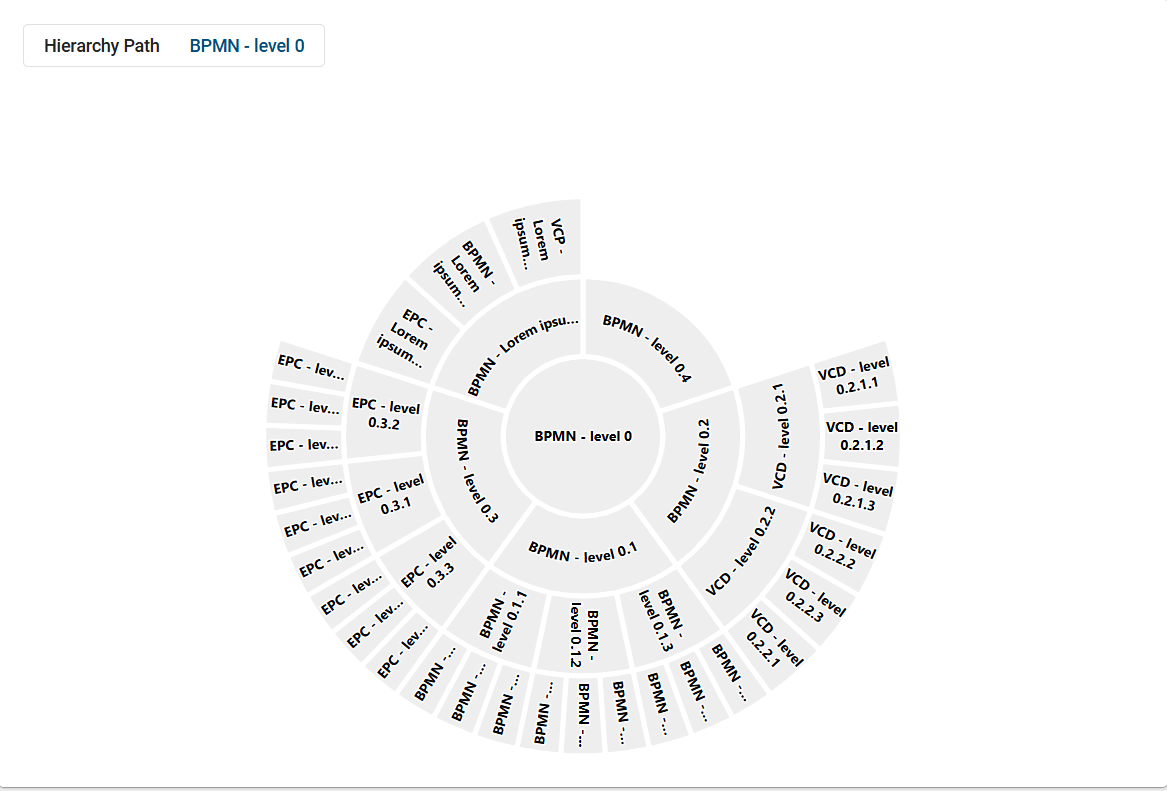
The display is shown as a sunburst diagram:
Each level is shown as a ring
The segments stand for individual processes
This helps you see how processes are connected and how they are structured. If the selected start diagram does not contain any subprocesses, no hierarchy can be displayed.
How can I navigate in the process hierarchy?
If BIC EAM has been purchased and activated for you, all users can open the Insights via the Insights menu item in the left menu bar. If BIC EAM has not been purchased or is not activated, only users with the Administrator, Editor, or Author user role can open the Insights. In this case, only the Process hierarchy Insight is available.
Open the Insights menu item in the left menu bar and select the Process hierarchy tile in the Hierarchy section. The process hierarchy is only available to users with the Administrator, Editor, or Author user role. Then select a start diagram.
After a start diagram has been selected, a sunburst diagram is displayed. Click a segment in the diagram to move deeper into the hierarchy. The selected segment then becomes the new center.
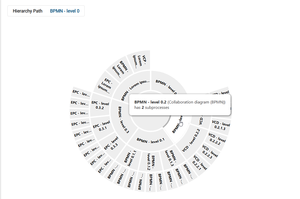
The subordinate processes are displayed in the outer rings. To move up one level again, click in the center of the diagram or use the navigation in the header.
When you move the mouse over a segment, additional information is displayed.
This includes:
the name of the process
the diagram type
the current level in the hierarchy
Note
Please note that a maximum of three rings are displayed at the same time. This keeps the display clear even when there are many processes. Processes can appear more than once if they are used in several parent processes.
How can I color processes in the process hierarchy?
If BIC EAM has been purchased and activated for you, all users can open the Insights via the Insights menu item in the left menu bar. If BIC EAM has not been purchased or is not activated, only users with the Administrator, Editor, or Author user role can open the Insights. In this case, only the Process hierarchy Insight is available.
Open the Insights menu item in the left menu bar and select the Process hierarchy tile in the Hierarchy section. The process hierarchy is only available to users with the Administrator, Editor, or Author user role. Then select a start diagram.
In the right sidebar, in the Settings panel, you will find the Coloring option.
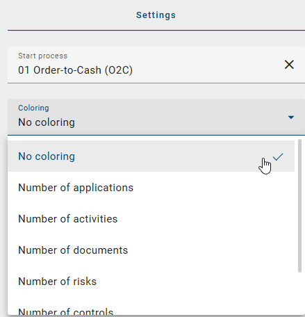
You can choose which criterion is used to color the processes. For example, the following options are available:
Number of applications
Number of activities
Number of documents
Number of risks
Number of controls
Number of roles
As soon as you select an option, the coloring is applied directly. The legend is updated automatically.

When you move the mouse over a segment, you also see the exact number of contained objects.
How can I display the details of a process in the process hierarchy?
If BIC EAM has been purchased and activated for you, all users can open the Insights via the Insights menu item in the left menu bar. If BIC EAM has not been purchased or is not activated, only users with the Administrator, Editor, or Author user role can open the Insights. In this case, only the Process hierarchy Insight is available.
Open the Insights menu item in the left menu bar and select the Process hierarchy tile in the Hierarchy section. The process hierarchy is only available to users with the Administrator, Editor, or Author user role. Then select a start diagram.
After a start diagram has been selected, a sunburst diagram is displayed. Right-click a segment in the diagram and select the Show attributes option.
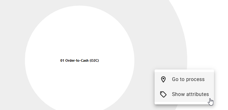
The details are displayed in the right sidebar. There, you will see all available information about the selected process.
How can I switch to a process within the process hierarchy?
If BIC EAM has been purchased and activated for you, all users can open the Insights via the Insights menu item in the left menu bar. If BIC EAM has not been purchased or is not activated, only users with the Administrator, Editor, or Author user role can open the Insights. In this case, only the Process hierarchy Insight is available.
Open the Insights menu item in the left menu bar and select the Process hierarchy tile in the Hierarchy section. The process hierarchy is only available to users with the Administrator, Editor, or Author user role. Then select a start diagram.
After a start diagram has been selected, a sunburst diagram is displayed. Right-click a segment in the diagram and select the Go to process option.
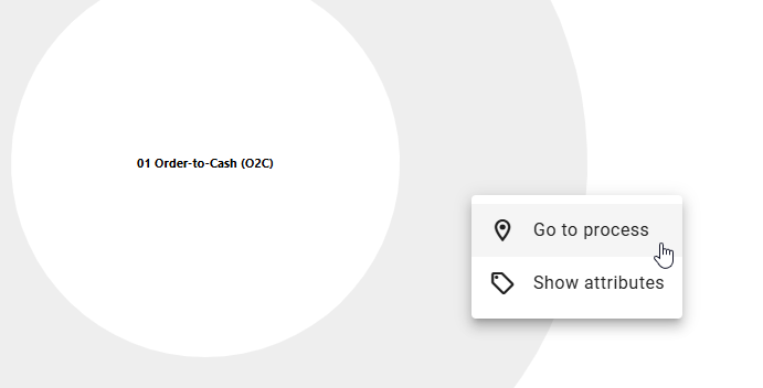
You are taken directly to the corresponding process. The view opens in the current repository and stage.