Discover the new user interface
To make the transition from the old to the new interface smoother for you, this chapter lists the essential functions.
Hint
Administrators have the option to set access only to the new user interface for particular roles. This means that certain users may only be able to use the new user interface and no longer the old user interface.
Welcome Screen
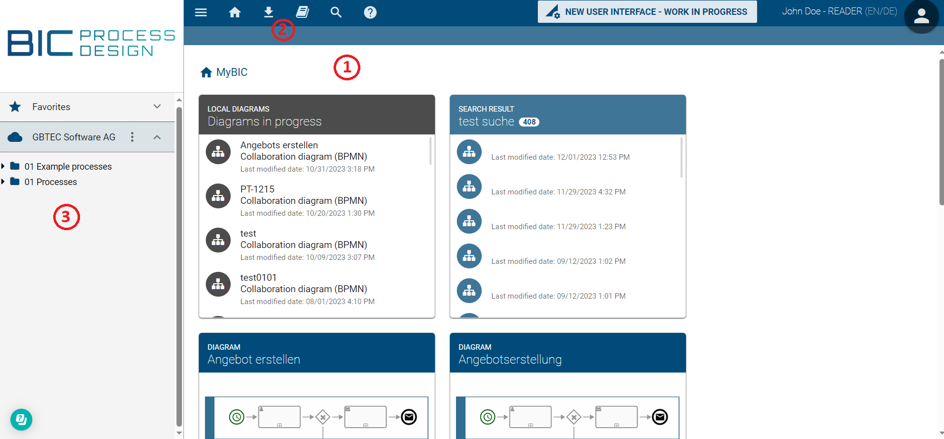
In transitioning between interfaces, notable differences are observed in the welcome screen. The key distinctions are now presented to you.
Old Interface:
New Interface:
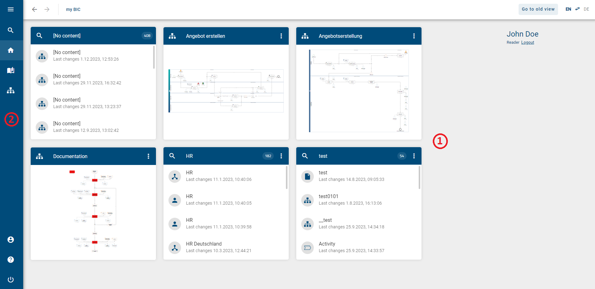
(1) Homepage: In the main area, you will find your myBIC page. Additionally, you can now rename the tiles of your favorite charts, catalog entries, and search results, and delete them directly from the myBIC page. The myBIC page is now displayed by default for every role.
(2) Menu Bar: In the new interface, the menu bar is now located on the left side of the screen. Additionally, you can now access your diagrams and profile and log out through the menu bar. Downloading reports is no longer done through the menu bar but through the respective Options in a section. In the header, you can see which section you are in.
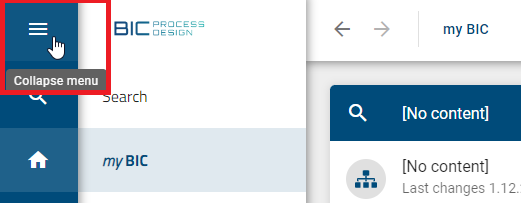
To get a better overview of the menu bar, you can collapse and expand the menu as needed using the button in the top left corner.
(3) Diagrams & Repository: In the old interface, you could access your diagrams and repositories through the left sidebar. In the new interface, you need to navigate to the Diagrams section for this.
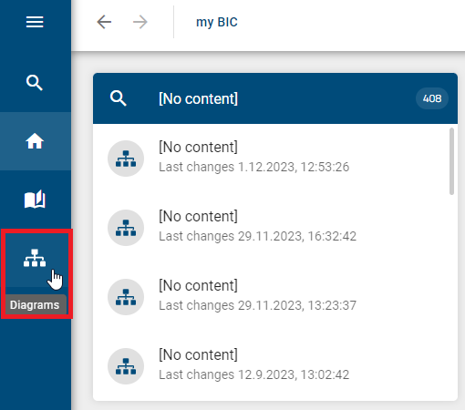
In the new interface, navigation is done both through the menu bar and the arrows in the header. To return to your welcome screen, click on myBIC or the Home icon in the menu bar.
Diagrams & Repository
To get an overview of your diagrams and repositories or to create a new diagram in the new interface, you need to go to the Diagrams section. This area affects all roles.
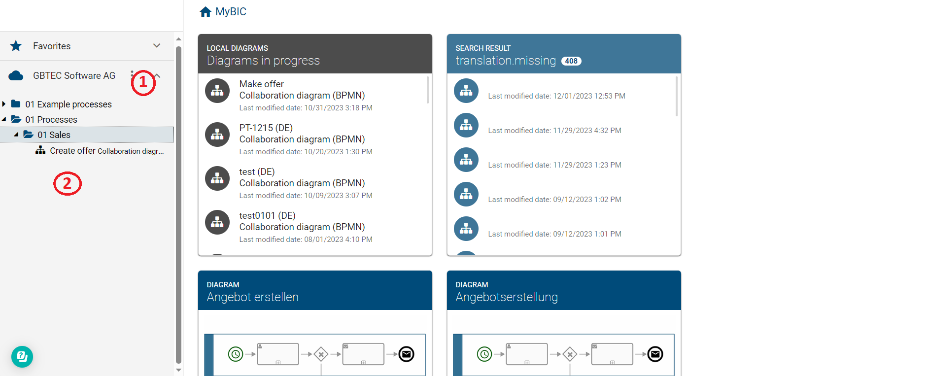
Old Interface:
New Interface:
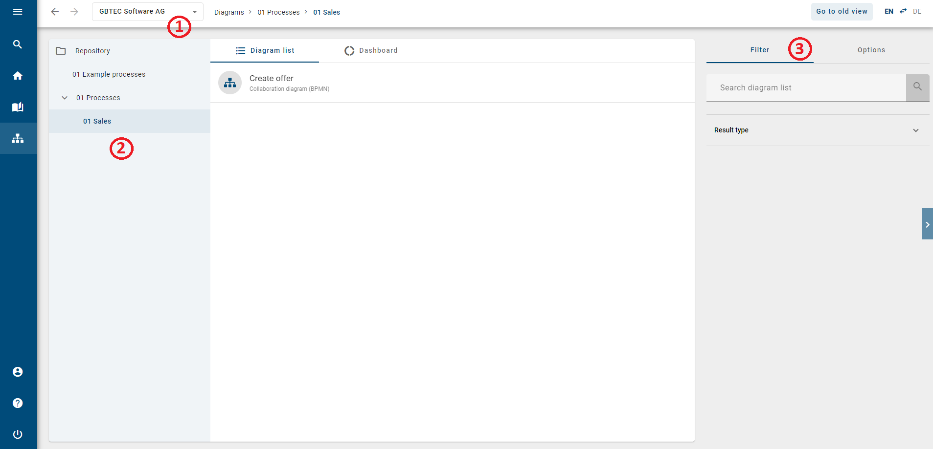
(1) Switching Repository: In the old interface, you had to click on the repository’s context menu to select a different repository. In the new interface, you can now do this directly in the header.
(2) Category Tree: The category tree is structurally similar to the old interface. Additionally, your current path is displayed in the header. In contrast to the old interface, diagrams are now presented in a list view. You will see only the diagrams from the selected category.
(3) Filter & Options: In the new interface, you can filter diagrams based on specific criteria or search for specific diagrams in advance. You can also create a matrix report or export the data to Excel through the Options.
Modeling
This area affect all roles that can model diagrams.
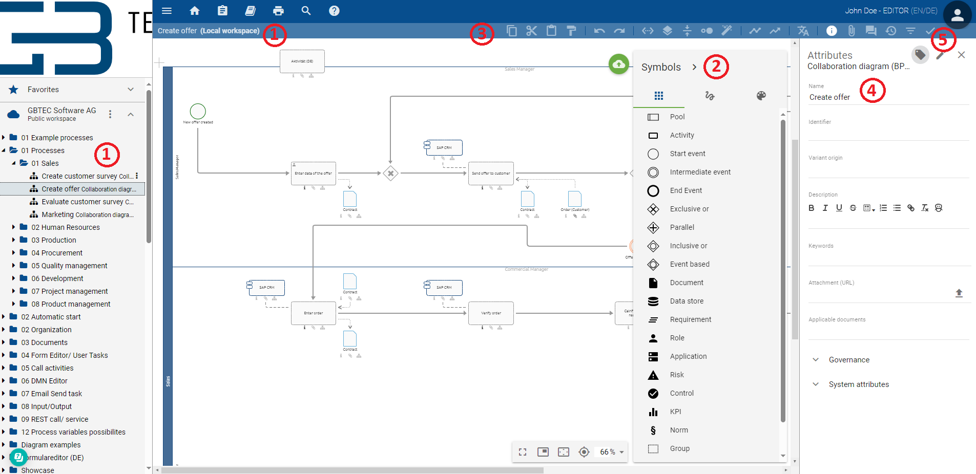
Old Interface:
Neue Interface:
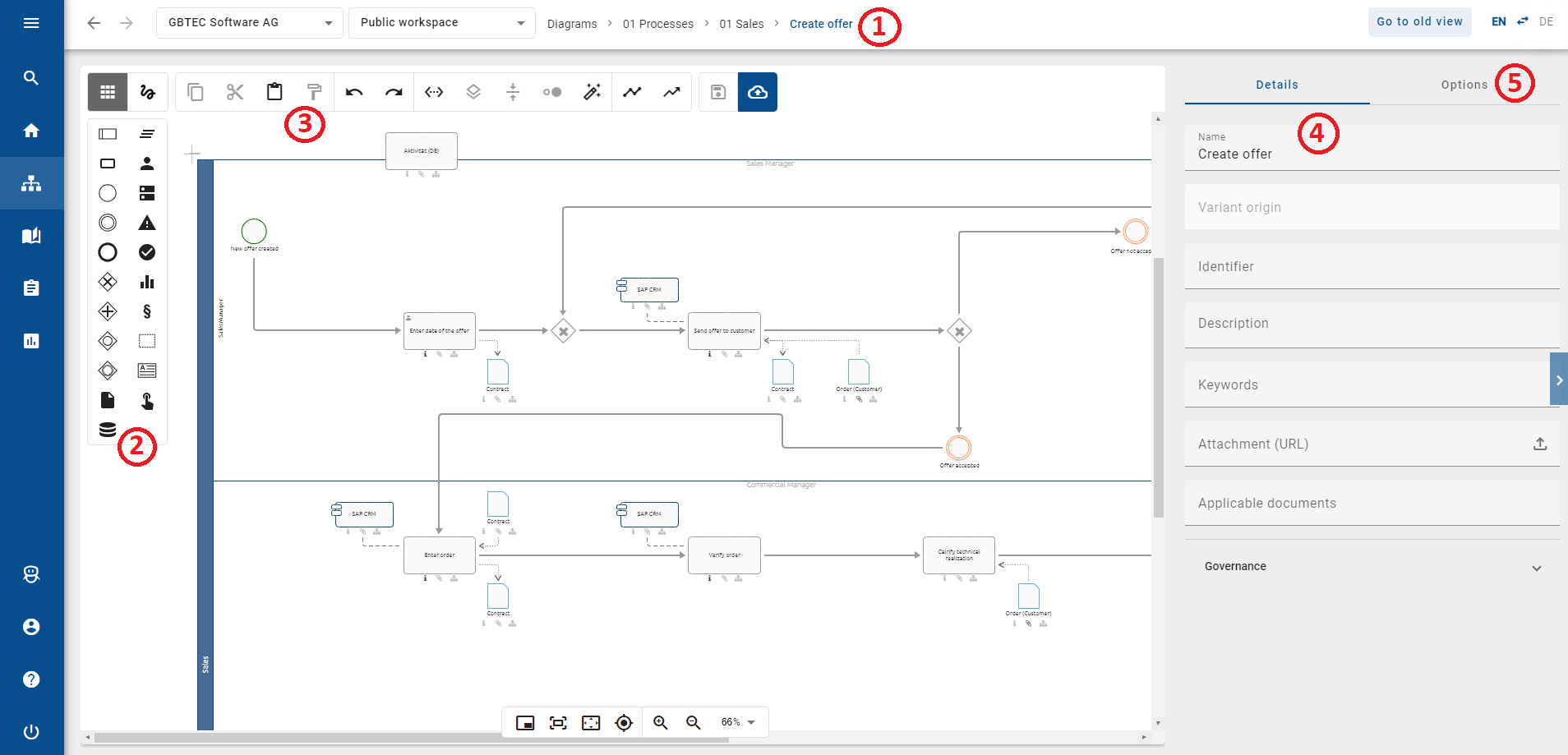
(1) Diagram and Stage: In the old user interface, you will no longer see your checked-out diagram in the category tree and menu bar. Instead, in the new user interface, you can see the checked-out diagram in the header and change the repository and/or stage of necessary.
(2) Symbol palette: The symbol palette in the new user interface has been redesigned to be more compact and user-friendly. It is now located as the first item in the editor. Hover over a symbol to view more information about it.
(3) Menu bar: The functions within the menu bar have been transferred to the new user interface in the same form and only adapted graphically. You will also find the function within the editor.
(4) Details: The details are displayed by default in the new user interface. However, the system attributes are no longer displayed during modeling.
(5) Options: Options such as Versions or Validation, which you could find in the menu bar in the old user interface, are now displayed in the Options tab.
Diagram view
This area affects all roles.
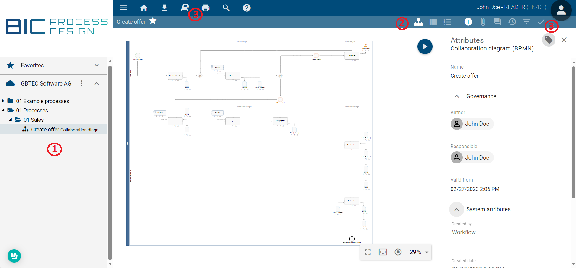
Old Interface:
New Interface:
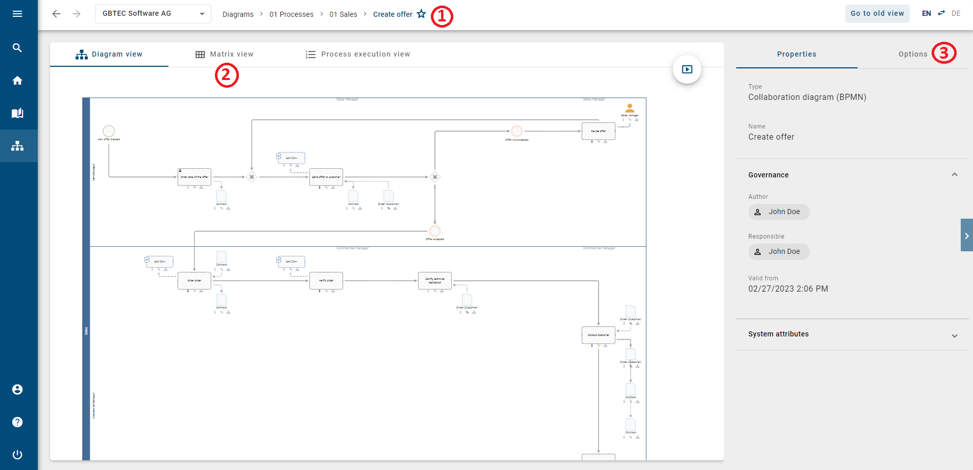
(1) Category Tree: In the new interface, the category tree is no longer presented in the same form as in the old interface. Instead, you can now navigate back to your categories through the header. Additionally, you have the option to change your repository at any time through the header.
(2) Alternative Views: Navigation to the matrix view and process execution view is now directly above the diagram and no longer in the toolbar.
(3) Options: The previous functions, such as comments or printing, which were located in the toolbar and menu bar in the old interface, can now be found under Options in the new interface. Additionally, the attributes of the diagram or an individual entity can now be found under Details.
Catalog
This area affects all roles.
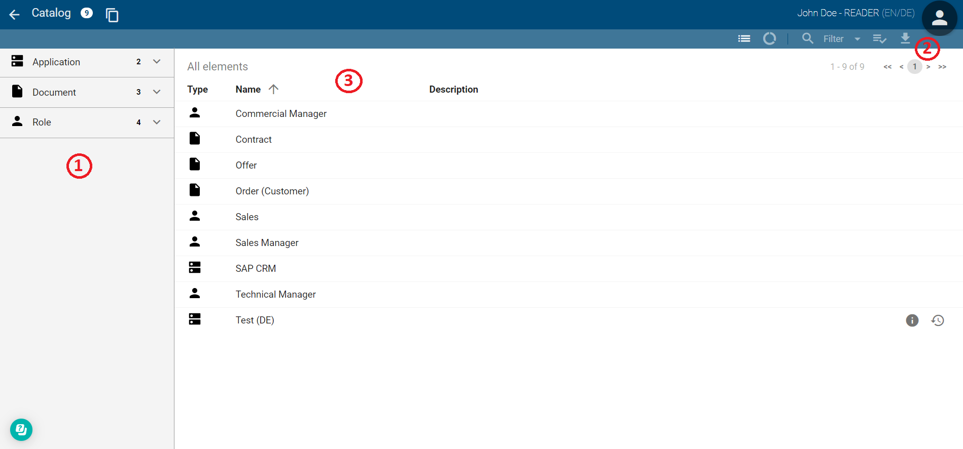
Old Interface:
New Interface:
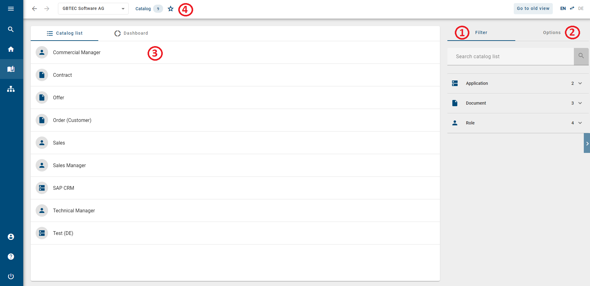
(1) Filter: In the new interface, you will find the filter area and search functions in the right sidebar.
(2) Download Report: The function to download a report, which was located in the toolbar in the old interface, can now be found under Options in the new interface.
(3) Catalog List: The catalog list in the new interface is structurally similar to the old interface. The description of a catalog entry is now displayed below the catalog name and no longer beside it.
(4) Switching Repository & Marking as Favorite: In the new interface, you now have the ability to switch the repository within the catalog. Additionally, you can mark (filtered) catalog lists as favorites, which will then be saved on your myBIC page.
Search
To initiate a search in the new interface, you need to navigate to the Search section through the menu. This area affects all roles.
Old Interface:
New Interface:
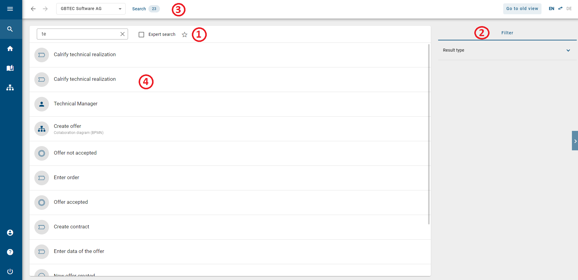
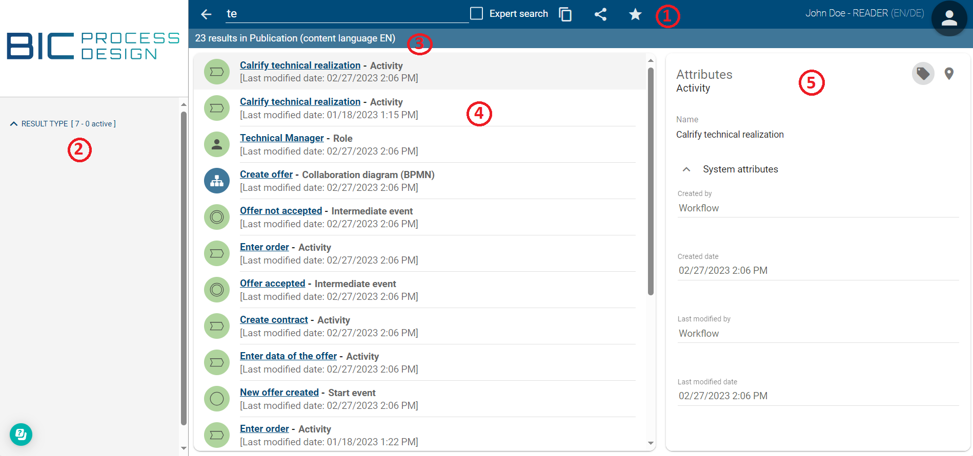
(1) Search: In the new interface, the search no longer takes place in the header but in the main area of the Search.
(2) Filter: In the new interface, you will find the filter area in the right sidebar.
(3) Number of Search Results: In the old interface, you could see the number of search results for the publication using the toolbar by default. In the new interface, these results are now displayed in the header bar. Additionally, you can change your repository here to expand the search.
(4) Search Results: In the new interface, you will only find the names of matching catalog entries and diagrams in the current content language in the search result list. Hovering over the icon provides information about whether it is a catalog entry or a diagram.
(5) Details of Search Results: While in the old interface, the details of the corresponding search result were displayed in the right sidebar, in the new interface, you need to click on the respective search result.

Subsequently, you will be directed straight to the corresponding diagram/catalog entry and will no longer be in the Search. This information is also available in the header. Here, you can view all details of the corresponding search result and, if needed, download the archive or the report.
Profile
In the new interface, the profile is now displayed as a separate menu section. To access it, go to the Profile section. This area affects all roles.
Old Interface:
New Interface:
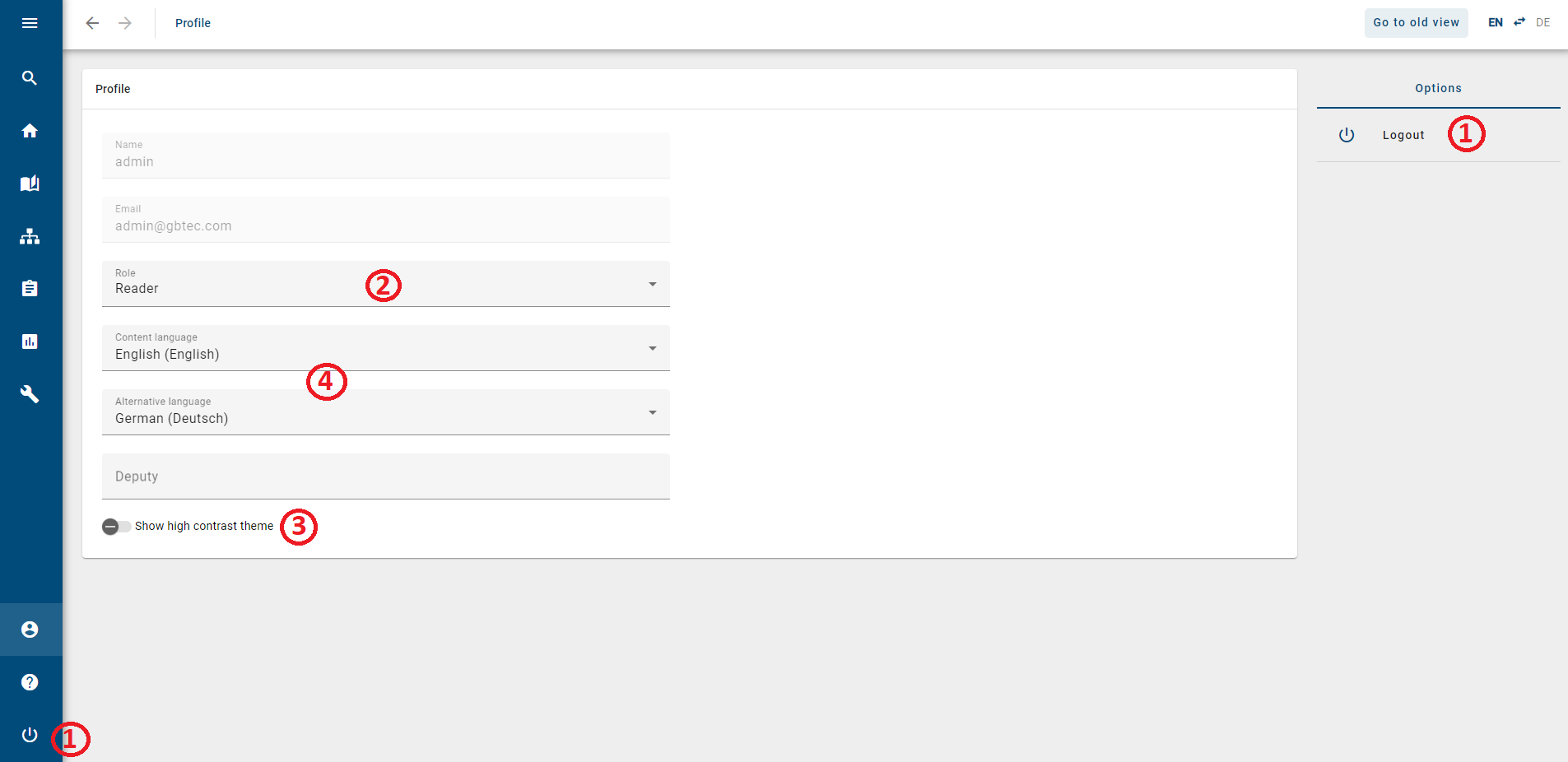
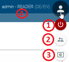
(1) Logout: In the new interface, you will find the Logout button both on the profile page in the right sidebar and consistently at the bottom of the menu bar.
(2) Change Role: The role can be adjusted on the profile page, provided that you have an appropriate role assigned in the user management.
(3) High Contrast: The high contrast mode is now more prominently marked on the profile page and can be toggled on and off as needed.
(4) Change Language: You can still adjust the language setting consistently in the header. Additionally, you can now set this on the profile page as well.
Furthermore, you can access your short profile from all areas. To do this, click on Profile in the menu bar.
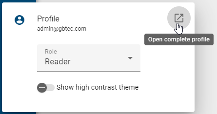
Here, you have the option to change your role and switch to high contrast if needed. To view your complete profile, click on the Open complete profile button located at the top right within the short profile.